Anscombe's Quartet, aka The Troll Dataset

Have you ever wondered what statisticians do for fun? You might think that they would enjoy going to casinos and ruining people’s nights by lecturing them about how they’re throwing money away by betting against the odds. Or perhaps you can picture one spending an entire day flipping a coin to hypothesis test whether it’s fair or biased.
But you’d be wrong. In reality, when a statistician is looking for a bit of mild amusement, they spend time finding creative ways to troll people. Check out a prime example below.
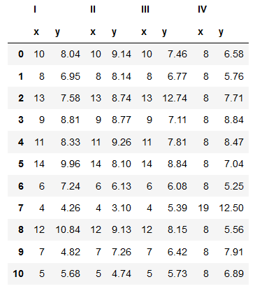
This is a dataset created by statistician Francis Anscombe in 1973. What we have here is four datasets (labelled I, II, III and IV because Roman numerals are cool) each consisting of 11 pairs of x and y coordinates.
(What quantities the coordinates actually represent isn’t particularly important for that sake of this discussion. You can make your own if you want. x could be number of scoops of ice cream in a given sundae and y could be the number of seconds it took me to eat the entire thing. Yum.)
Because the human brain is rubbish at gleaning information from tabular data — even for this pathetically small dataset — let’s plot out each of the four datasets and compare them.
(For ease of comparison, each of the four datasets has been plotted on x- and y-axes of the same scale.)
You may be wondering where I’m going with this. These four datasets seem to have very little in common — they all show wildly different trends and you’d have to be a fool to get them mixed up with one another.
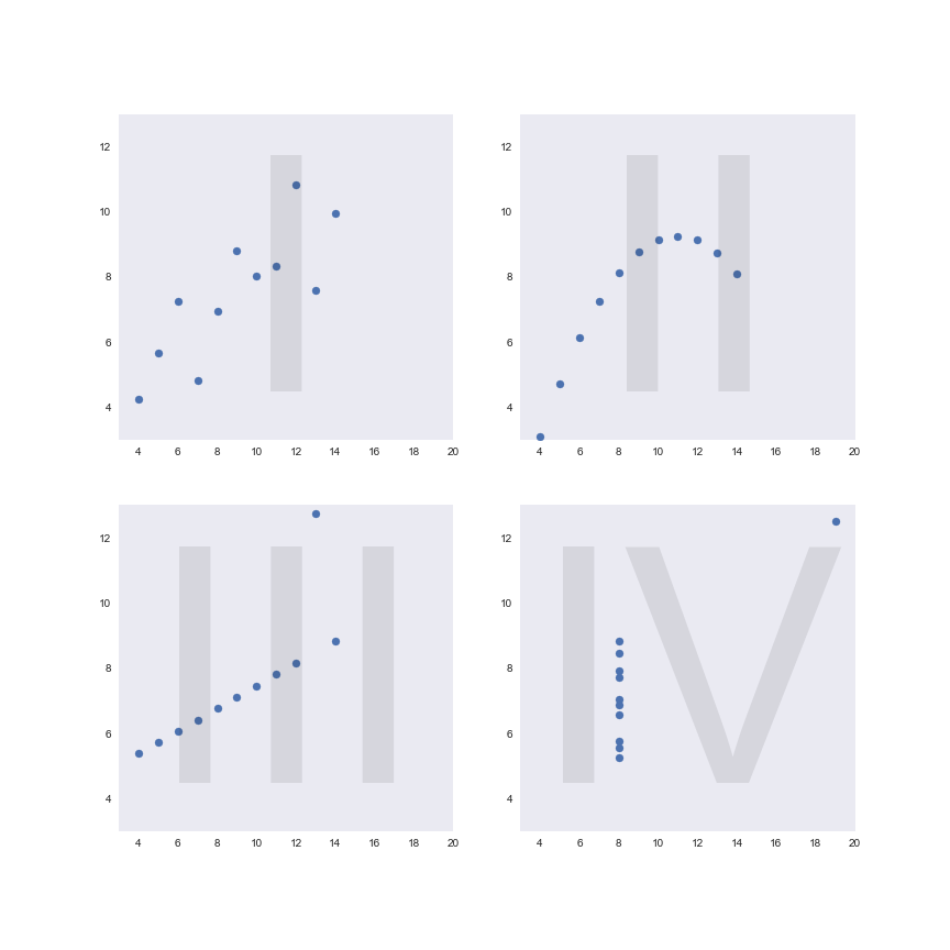
Well, let’s see what happens when we call on our old friend linear regression.
Uh oh… it’s the same line of best fit for all of them! How has that happened?
Maybe we can spot a difference in the correlations between x and y for each set of data.
Correlation coefficient for:

Dataset I: 0.81642051634484
Dataset II: 0.8162365060002428
Dataset III: 0.8162867394895982
Dataset IV: 0.8165214368885031
Now we’re really in trouble… the correlation coefficients are all basically the same too! Is there any way we can distinguish these datasets from their summary statistics?
(Mean of x values, mean of y values) for:

Dataset I: (9.0, 7.5)
Dataset II: (9.0, 7.5)
Dataset III: (9.0, 7.5)
Dataset IV: (9.0, 7.5)


(Variance of x values, variance of y values) for:

Dataset I: (11.0, 4.13)
Dataset II: (11.0, 4.13)
Dataset III: (11.0, 4.12)
Dataset IV: (11.0, 4.12)
What a nightmare! The majority of the simple, straightforward summary statistics that you might want to use to describe each of these datasets are the same for all four — despite us having seen that the shape and pattern of the data are not at all similar.
You might wonder what manner of terrible thing could have happened if we didn’t bother plotting out our data beforehand. We may well have seen the identical summary statistics and assumed that all four datasets had the same distribution. Our conclusion — and any actions taken as a result — would have been way off the mark.
So consider this a cautionary tale — while summary statistics are certainly useful and can provide us with more precise information than we can gather from just eyeing up a graph, their simplistic nature can also deceive. In your exploratory data analysis, never skip over visualising your data: plotting, re-plotting, and plotting again in different ways to try and expose new patterns.
Because as we’ve seen, the cold, hard numbers may be lying to you.
More info and credits
Andrew Hetherington is an actuary and data enthusiast working in London, UK. All views are Andrew’s own and not those of his employer. Connect with him on LinkedIn.
Dataset: Anscombe, F. J. (1973). “Graphs in Statistical Analysis”. American Statistician. 27 (1): 17–21. doi 10.1080/00031305.1973.10478966. JSTOR 2682899.
Road sign photo by Mark König on Unsplash.